Secret Dokhon
Brand Style Guide
A simple reference for using the Secret Dokhon logo, colors, spacing and typography consistently across every touchpoint.
SVG and PNG logo files, social avatars and favicons in all three approved colors.
Packaging mockups (PNG)Secret Dokhon
Logo usage
The logo may be shown on ivory or espresso backgrounds
Clear space
Keep clear space around the SD monogram equal to the height of the letter S (about 45% of the mark) on all four sides. Nothing may enter that zone.
Minimum size
Monogram: 24 px on screen, 8 mm in print. Full lockup: 120 px wide on screen, 30 mm in print. For favicons use the exported 16 and 32 px files.
Don'ts
- Don't stretch, tilt, or distort the logo
- Don't place the mark on busy backgrounds
- Don't add rings, dots, shadows or gradients to the mark
Approved colors
The SD monogram ships in three variants only — espresso black, warm ivory and taupe gold.
Secret Dokhon
Color palette
Use the exact values below for digital and print consistency.
Warm ivory
#F5EFE5
oklch(0.951 0.017 84.5)
Espresso
#17120F
oklch(0.198 0.014 55)
Deep cocoa
#2A1C16
oklch(0.263 0.032 45)
Muted gold
#B49772
oklch(0.68 0.045 72)
Soft sand
#D9C9B5
oklch(0.836 0.028 78)
Secret Dokhon
Packaging
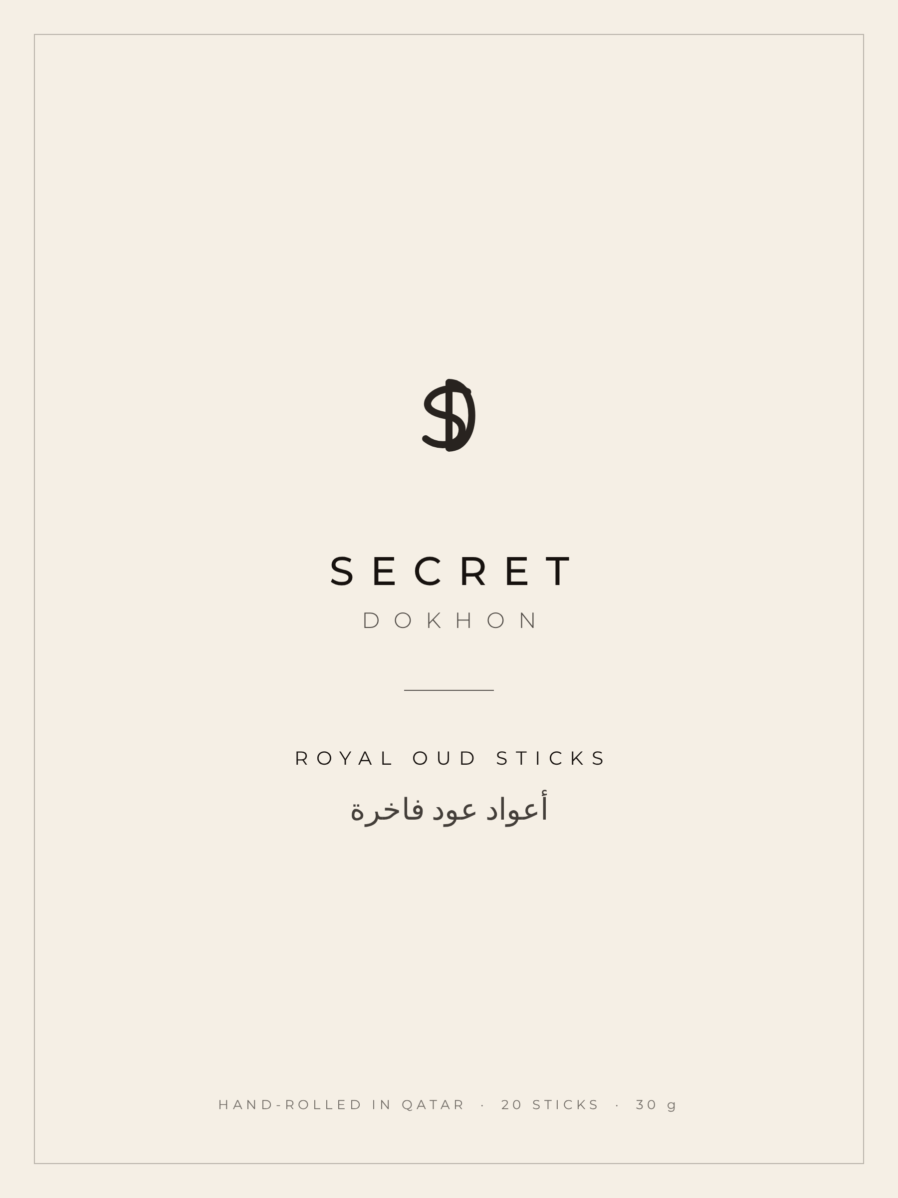
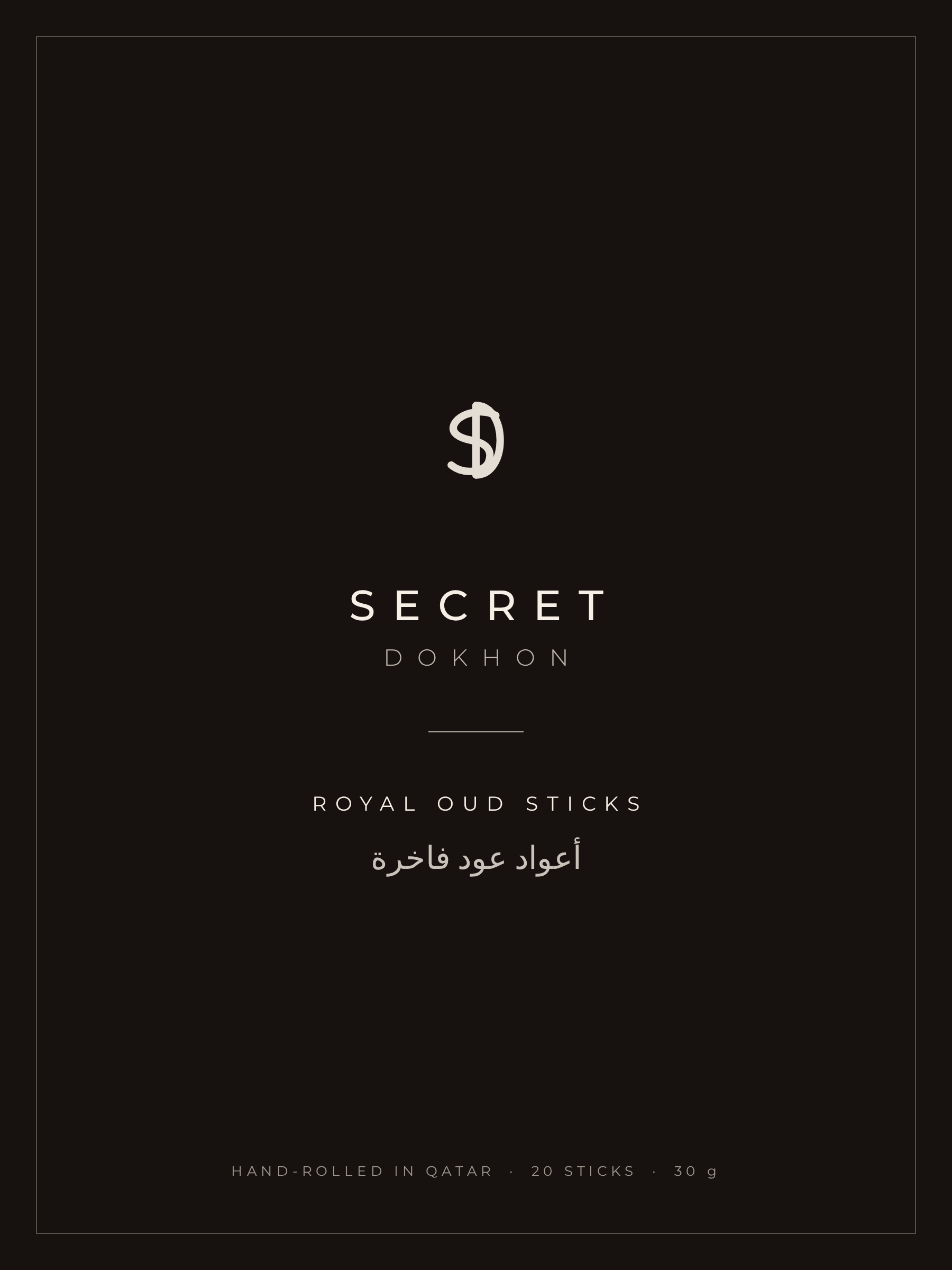
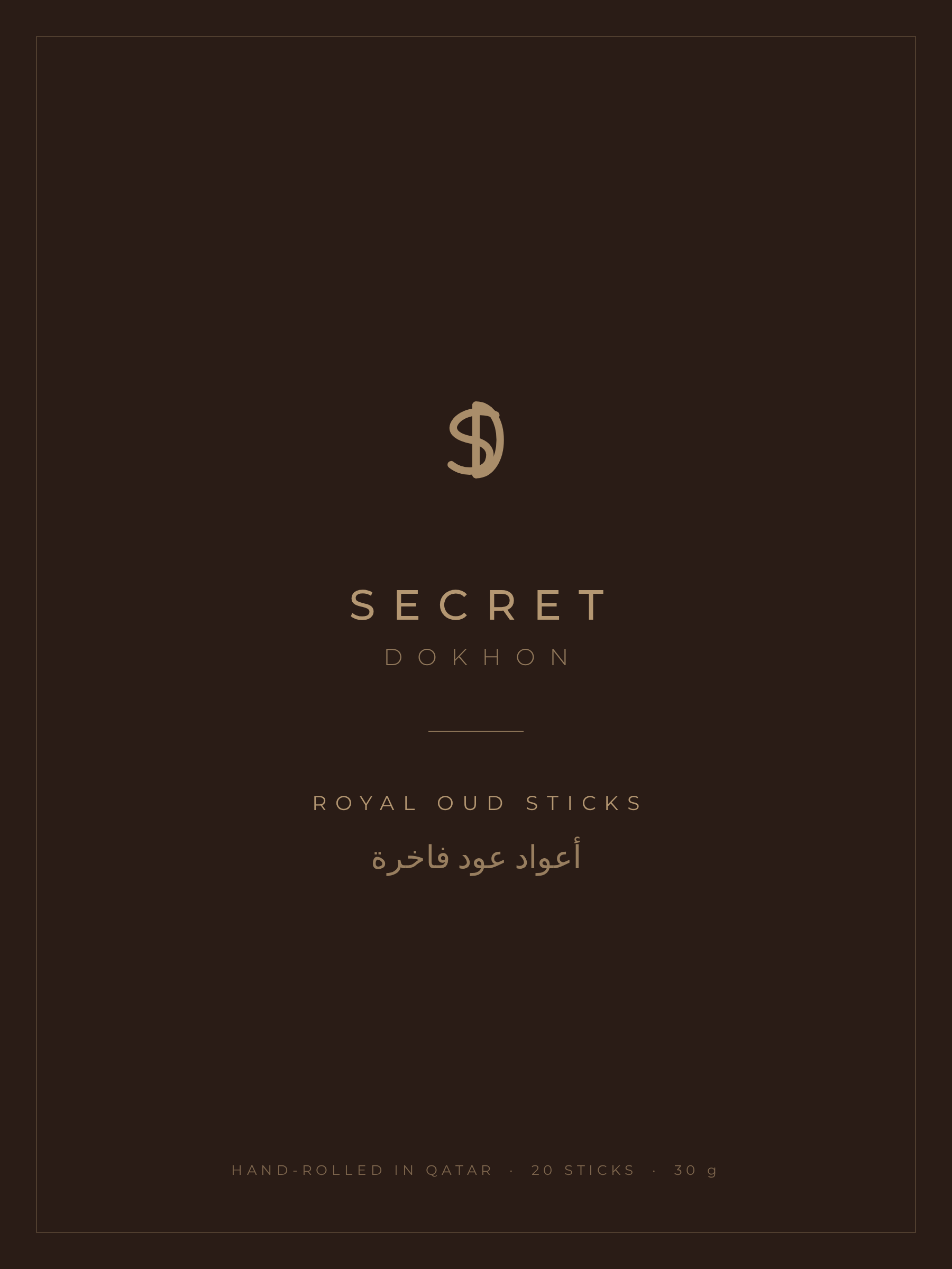
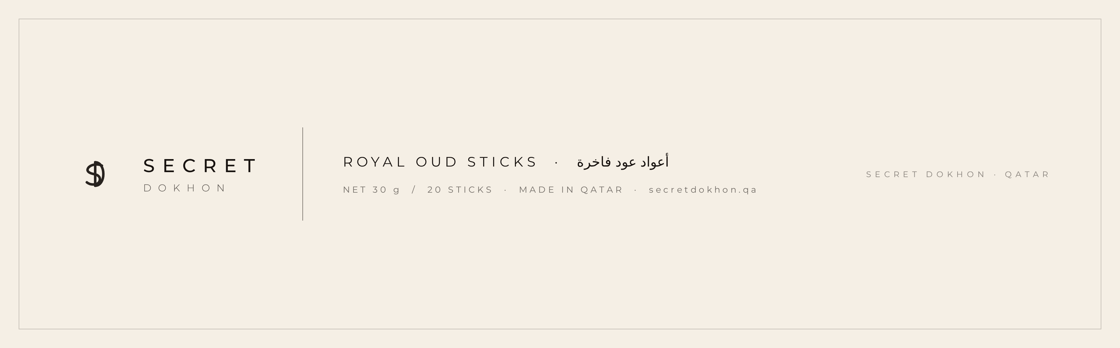
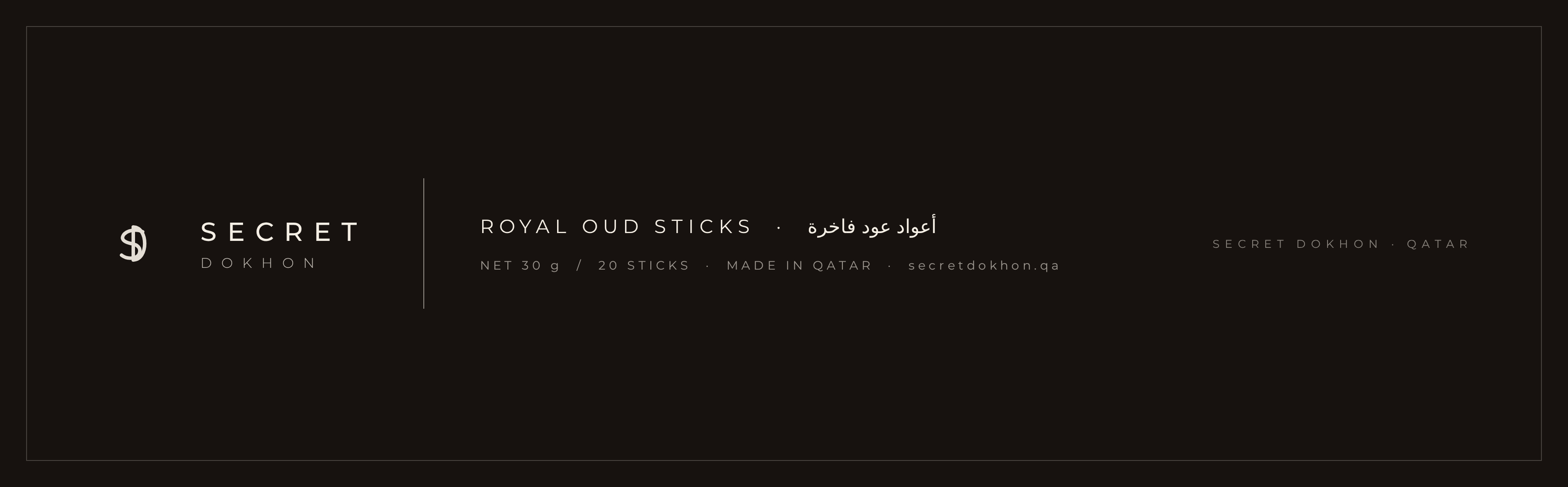
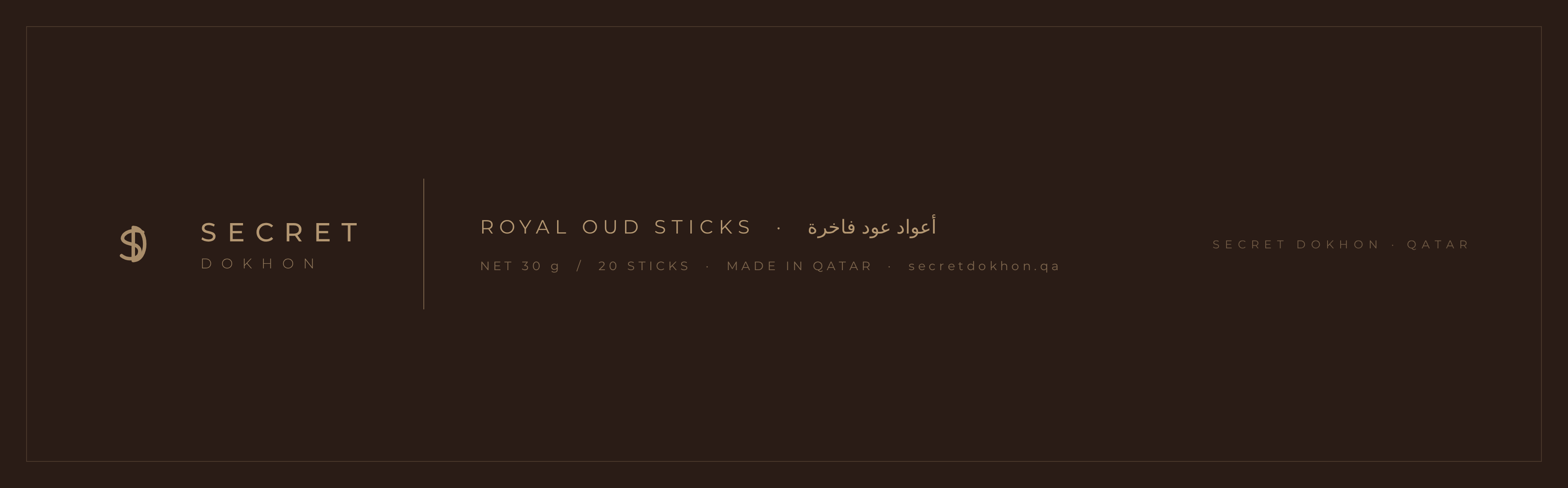
Front label and box side panel artwork using the SD monogram in espresso black, warm ivory and taupe gold.
Secret Dokhon
Typography
Luxury Oud
Headline — Heading
Hand-rolled oud sticks, crafted for memorable spaces.
Body text
Headlines use Cormorant Garamond for English and IBM Plex Sans Arabic for Arabic. The wordmark is set in Montserrat. Body text uses IBM Plex Sans Arabic / system sans-serif.
Secret Dokhon
Spacing system
A small scale based on the radius of the logo ring for predictable rhythm across layouts.
Tight
Small
Medium
Large
Hero